Use a real <table>. Wrap it in a scroll box. For sticky rows or columns, use fixed widths, border-collapse: separate, and draw the borders yourself.
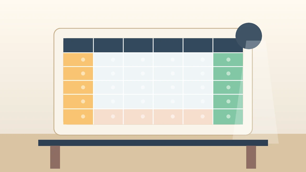
Final shape
Scroll this table sideways and down. The header, first two columns, right Total column, and bottom Grand total row stay visible.
| Category | Product | Q1 | Q2 | Total | ||||
|---|---|---|---|---|---|---|---|---|
| Jan | Feb | Mar | Apr | May | Jun | |||
| Fruit | Apples | 120 | 140 | 135 | 150 | 160 | 170 | 875 |
| Bananas | 90 | 100 | 95 | 110 | 115 | 120 | 630 | |
| Drinks | Tea | 60 | 65 | 70 | 75 | 80 | 85 | 435 |
| Coffee | 130 | 125 | 140 | 145 | 150 | 155 | 845 | |
| Snacks | Cookies | 75 | 80 | 85 | 90 | 95 | 100 | 525 |
| Chips | 95 | 90 | 100 | 105 | 110 | 115 | 615 | |
| Grand total | 570 | 600 | 625 | 675 | 710 | 745 | 3925 | |
How the final shape works
HTML structure
<!-- Scope wrapper: keeps demo CSS from affecting other tables -->
<div class="pivot-demo pivot-demo-final">
  <!-- Scroll container: creates horizontal and vertical scroll -->
  <div class="scroll">
    <table>
      <!-- Column widths: locks real widths for sticky columns -->
      <colgroup>
        <col class="c1">  <!-- First sticky column -->
        <col class="c2">  <!-- Second sticky column -->
        <col span="6">    <!-- Six month columns -->
        <col class="ct">  <!-- Right Total column -->
      </colgroup>

      <thead>
        <tr>
          <!-- rowspan="2": makes cells cover both header rows -->
          <th class="stick left-1" rowspan="2">Category</th>
          <th class="stick left-2" rowspan="2">Product</th>
          <!-- colspan="3": groups months under quarters -->
          <th colspan="3">Q1</th>
          <th class="before-right" colspan="3">Q2</th>
          <!-- Sticky right Total column header -->
          <th class="stick right" rowspan="2">Total</th>
        </tr>
        <tr>
          <th>Jan</th><th>Feb</th><th>Mar</th>
          <th>Apr</th><th>May</th>
          <!-- before-right: removes border before sticky Total column -->
          <th class="before-right">Jun</th>
        </tr>
      </thead>

      <tbody>
        <tr>
          <!-- rowspan="2": groups one category across two products -->
          <th class="stick left-1" rowspan="2">Fruit</th>
          <th class="stick left-2">Apples</th>
          <td>120</td><td>140</td><td>135</td>
          <td>150</td><td>160</td>
          <td class="before-right">170</td>
          <!-- Sticky right Total value -->
          <td class="stick right">875</td>
        </tr>
        <!-- More rows... -->
        <tr>
          <!-- touch-footer: rowspan cell that reaches the sticky footer -->
          <th class="stick left-1 touch-footer" rowspan="2">Snacks</th>
          <!-- More cells... -->
        </tr>
      </tbody>

      <!-- tfoot: sticky Grand total row -->
      <tfoot>
        <tr>
          <!-- grand-label: spans both left sticky columns -->
          <th class="stick grand-label" colspan="2">Grand total</th>
          <td>570</td><td>600</td><td>625</td>
          <td>675</td><td>710</td>
          <td class="before-right">745</td>
          <td class="stick right">3925</td>
        </tr>
      </tfoot>
    </table>
  </div>
</div>
CSS structure
.pivot-demo-final {
  /* Width variables: store column widths in one place */
  --c1: 6rem;
  --c2: 7rem;
  --total: 5.5rem;
}

/* Scroll container: creates horizontal and vertical scrolling */
.pivot-demo-final .scroll {
  max-height: 18rem;
  overflow: auto;
}

.pivot-demo-final table {
  /* border-collapse: separate avoids sticky-border bugs from collapsed borders */
  border-collapse: separate;
  border-spacing: 0;
  /* Fixed layout: makes column widths predictable for sticky offsets */
  table-layout: fixed;
  width: 880px;
  min-width: 880px;
}

/* Column widths applied through colgroup */
.pivot-demo-final .c1 { width: var(--c1); }
.pivot-demo-final .c2 { width: var(--c2); }
.pivot-demo-final .ct { width: var(--total); }

.pivot-demo-final th,
.pivot-demo-final td {
  /* Grid lines: draw right and bottom borders */
  border: 0;
  border-right: 1px solid #999;
  border-bottom: 1px solid #999;
  padding: 0.35rem 0.5rem;
  white-space: nowrap;
}

/* Top border: draws the top edge of the table */
.pivot-demo-final thead tr:first-child th {
  border-top: 1px solid #999;
}

/* Border fix: removes right border before sticky Total column */
.pivot-demo-final .before-right { border-right: 0; }

/* Border fix: removes bottom border from last body row */
.pivot-demo-final tbody tr:last-child > *,
.pivot-demo-final .touch-footer { border-bottom: 0; }

/* Sticky header: sticks to top while scrolling down */
.pivot-demo-final thead {
  position: sticky;
  top: 0;
  z-index: 4;
}

/* Sticky footer: sticks to bottom while scrolling down */
.pivot-demo-final tfoot {
  position: sticky;
  bottom: 0;
  z-index: 4;
}

/* Background: stops scrolled cells from showing through sticky cells */
.pivot-demo-final thead th,
.pivot-demo-final tfoot th,
.pivot-demo-final tfoot td,
.pivot-demo-final .stick {
  background: var(--bg-body, white);
}

/* Shared sticky behavior for individual cells */
.pivot-demo-final .stick {
  position: sticky;
  z-index: 2;
}

/* First sticky column: pinned to left edge */
.pivot-demo-final .left-1 {
  left: 0;
  border-left: 1px solid #999;  /* Draws left edge of table */
  width: var(--c1);
  min-width: var(--c1);
  max-width: var(--c1);
}

/* Second sticky column: positioned after first column */
.pivot-demo-final .left-2 {
  left: var(--c1);
  width: var(--c2);
  min-width: var(--c2);
  max-width: var(--c2);
}

/* Right sticky Total column: pinned to right edge */
.pivot-demo-final .right {
  right: 0;
  border-left: 1px solid #999;  /* Draws its own left border */
  width: var(--total);
  min-width: var(--total);
  max-width: var(--total);
}

/* Grand total label: spans both left sticky columns */
.pivot-demo-final .grand-label {
  left: 0;
  border-left: 1px solid #999;
  width: calc(var(--c1) + var(--c2));
  min-width: calc(var(--c1) + var(--c2));
  max-width: calc(var(--c1) + var(--c2));
  z-index: 5;
}

/* z-index layering: sticky intersections above normal cells */
.pivot-demo-final thead .stick,
.pivot-demo-final tfoot .right {
  z-index: 5;
}
Why the border fixes are necessary
Sticky tables are easy to make messy because sticky cells sit above scrolling cells.
border-collapse: collapse looks simpler, but with sticky cells the borders can appear to move with the scrolling table. border-collapse: separate plus border-spacing: 0 gives us a clean grid while keeping each border attached to a real cell.
The Total column draws its own left border. That is why the cell before it uses .before-right: without it, you see two borders touching each other.
The sticky footer draws its own top border. That is why the last body row removes its bottom border. If a rowspan cell reaches the footer, add .touch-footer to that cell too.
Step 1: Make a normal table
Start with the data. Use <th> for labels and <td> for numbers.
<table>
  <thead>
    <tr>
      <th>Category</th>
      <th>Product</th>
      <th>Jan</th>
      <th>Total</th>
    </tr>
  </thead>
  <tbody>
    <tr>
      <th>Fruit</th>
      <th>Apples</th>
      <td>120</td>
      <td>120</td>
    </tr>
  </tbody>
</table>
Step 2: Merge cells with HTML
CSS does not merge table cells. HTML does.
Use colspan to stretch across columns:
<tr>
  <th rowspan="2">Category</th>
  <th rowspan="2">Product</th>
  <th colspan="3">Q1</th>
  <th rowspan="2">Total</th>
</tr>
<tr>
  <th>Jan</th>
  <th>Feb</th>
  <th>Mar</th>
</tr>
Use rowspan to stretch down rows:
<tr>
  <th rowspan="2">Fruit</th>
  <th>Apples</th>
  <td>120</td>
</tr>
<tr>
  <th>Bananas</th>
  <td>90</td>
</tr>
Step 3: Add scroll before sticky
Wide tables should scroll inside a box. The page itself should not become wider.
<div class="scroll">
  <table>...</table>
</div>
.scroll {
  overflow: auto;
}

table {
  min-width: 880px;
}

th,
td {
  white-space: nowrap;
}
If you also want vertical scrolling, add max-height to the wrapper.
Step 4: Use the sticky border pattern
This is the minimized CSS pattern behind the final table.
Show the full sticky CSS pattern
First, lock the sticky column widths with <colgroup>:
<colgroup>
  <col class="c1">
  <col class="c2">
  <col span="6">
  <col class="ct">
</colgroup>
.pivot {
  --c1: 6rem;
  --c2: 7rem;
  --total: 5.5rem;
}

.pivot .scroll {
  max-height: 18rem;
  overflow: auto;
}

.pivot table {
  border-collapse: separate;
  border-spacing: 0;
  table-layout: fixed;
  width: 880px;
}

.pivot .c1 { width: var(--c1); }
.pivot .c2 { width: var(--c2); }
.pivot .ct { width: var(--total); }

.pivot th,
.pivot td {
  border: 0;
  border-right: 1px solid #999;
  border-bottom: 1px solid #999;
  padding: 0.35rem 0.5rem;
  white-space: nowrap;
}

.pivot thead { position: sticky; top: 0; z-index: 4; }
.pivot tfoot { position: sticky; bottom: 0; z-index: 4; }

.pivot thead th,
.pivot tfoot th,
.pivot tfoot td,
.pivot .stick {
  background: white;
}

.pivot .stick { position: sticky; z-index: 2; }
.pivot .left-1 { left: 0; width: var(--c1); min-width: var(--c1); max-width: var(--c1); }
.pivot .left-2 { left: var(--c1); width: var(--c2); min-width: var(--c2); max-width: var(--c2); }
.pivot .right { right: 0; width: var(--total); min-width: var(--total); max-width: var(--total); border-left: 1px solid #999; }
.pivot .grand-label { left: 0; width: calc(var(--c1) + var(--c2)); min-width: calc(var(--c1) + var(--c2)); max-width: calc(var(--c1) + var(--c2)); }

.pivot .before-right { border-right: 0; }
.pivot tfoot th,
.pivot tfoot td { border-top: 1px solid #999; }
.pivot tbody tr:last-child > *,
.pivot .touch-footer { border-bottom: 0; }
The important border fixes are before-right, border-top on the footer, and touch-footer for a rowspanning cell that reaches the footer.
Step 5: Add the sticky classes
The classes are boring, but they make the table predictable.
<th class="stick left-1" rowspan="2">Category</th>
<th class="stick left-2">Apples</th>
<td class="before-right">170</td>
<td class="stick right">875</td>
<th class="stick grand-label" colspan="2">Grand total</th>
Use touch-footer only when a rowspan cell reaches the footer but starts before the last row:
<th class="stick left-1 touch-footer" rowspan="2">Snacks</th>
Checklist
- Use
<table>, not divs. - Use
colspanandrowspanfor merged cells. - Put scroll on a wrapper.
- Use fixed widths for sticky columns.
- Use
border-collapse: separatefor sticky tables. - Give sticky cells a background.
- Let sticky footer and sticky total cells draw their own borders.
That is enough for a readable static pivot table with only HTML and CSS.